
Monday, August 2, 2010
Friday, July 30, 2010
Dear Old Grandfather
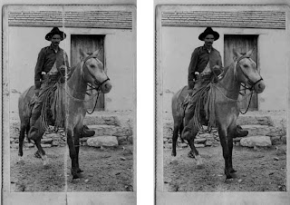

1. We began this assignment in Adobe Photoshop.
2. We then made another layer and duplicated the original picture to have a before and after image.
3. In the first image we took out the big crease with the stamp clone tool, healing brush, and spot healing brush.
4. After we removed the crease, we used the history brush to either lighten or darken the dust and scratches on the picture.
5. Once we finished the minor details we opened a new document and started coloring the picture.
6. We masked the individual parts of the picture like the bridle, horse, rope, and subtracted the selections from each other. We changed the color of each part by making an adjustment layer and adjusting the hue and saturation.
7. The end product was a more modern version of the original picture, with no scratches, creases, or dust marks, and all in color.
It was good that we were actually able to make the crease go away, and make the picture look as good as new. The only thing that did not work out is that there were so many details in this picture to color, it was hard to mask the individual parts perfectly.
Flawless Skin Girl

1. We began this assignment in Photoshop.
2. We made a duplicate layer of the original photo to show a before and after image.
3. In order to retouch this photo, we made a heal layer and did all of the retouches in that layer.
4. With the healing brush, we removed the glare on the girl's forehead, nose, and cheeks. After the retouching, we flattened the layers.
5. Then we blurred the face, and erased all of the details like the eyes, hair, mouth, and ears.
6. We then made an adjustment layer and adjusted the hue and saturation to put eyeshadow on her eyes and change her eye color, we repeated this step with the lips.
7. Our final product was a girl with flawless skin and beautiful makeup.
It was good that we were able to completely change the appearance and add makeup to the girl to make it look like her original self. It was really hard to completely take out the glare on the girl's forehead, other than that it was really fun to try different eyeshadow colors on the girl.
Retouched Family

1. We also retouched this photo in Adobe Photoshop.
2. First, we made a duplicate layer to show the before and after images.
3. We then made a heal layer and began removing the tape with the stamp clone tool, spot healing brush, and healing brush.
4. After removing the tape, we edited the man's nose, by copying another man's nose and placing it on top of the old nose.
5. We then merged the layers down and went to histories and removed all of the dust and scratches on the photograph.
It was good that we were able to remove the tape, but it was a little difficult to completely remove the tape and clone the areas around the tape.
Thursday, July 29, 2010
Marbled Paper Flip Pad
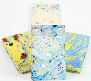

1. To begin this assignment we placed paper in water and put different oil paints in the water to make various designs.
2. We let it dry for the day and then measured the size of the notepad we wanted to make both an inside and outside cover on the front and back.
3. We cut the paper out and glued the paper to a cardboard in the shape of a rectangle.
4. After cutting and gluing, we punched two holes on the top of the notepad using the hole punch drill.
5. We then placed two screws in the top in order to bind the notepad.
6. In the end, we took a picture using the camera and the lights to capture the image of our hardwork.
It was really unique to be able to make paper have a marble look to it, I enjoyed swirling the paint around to make the different designs. When I used the drills to punch my holes, the holes did not come out perfectly, it was a bit rough around the edges, but in the end the screw fit in fine and looked good.
Wednesday, July 28, 2010
Notepads
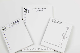

1. In this assignment we used Adobe Illustrator to make personalized notepads that would not only look decorative but function as a notepad.
2. I used an 8.5" x 11" paper and cut it in half to make a long notepad, and then on the other half I split the half page into another half to make two smaller notepads.
3.Before placing text or images, I placed a 1/4" margin around each notepad.
4. I used various swatches to get the images to design my notepads.
5. Then using grayscale, I made the images various shades of black and gray.
6. Once I printed 50 pages of the notepad, I used the guillotine cutter to cut the notepad in the specified places.
7. Then I placed the notepads in the padding machine and placed a thin layer of glue on the top end of the notepad 3 times for every 15 minutes.
It was good that we were able to personalize these notepads and add whatever text or images I wanted to add to it. It was a little difficult to do the padding because at times there was not enough pressure on the notepads.
Tuesday, July 27, 2010
Black Square Project InDesign


 1. The first step of this assignment was to make our own thumbnails. We used a T-Square and triangles to make 12 perfect thumbnails, that were all equally the same size and equally spaced.
2. Once we made the thumbnails, we designed our images we were going to use, using only 4 black squares to create the image of a certain word.
3. We then went into Adobe Illustrator and started making the individual images and then making another square with the definition of the word.
4. Then, we made our dummy of what the original book would look like, making sure there were margins, and everything was measured and equally spaced.
5. The final step of the Black Square Project was in InDesign.
6. Using the dummy to help figure out the layout of the book, I made 4 pages and placed the images from Adobe Illustrator into InDesign.
7. Once I placed the squares in the right places, according to the dummy, I placed the page numbers on each page.
8. I then made the cover page and added an autobiogrpahy to the back page. I had a photograph taken of myself to put on the back cover.
9. Once I printed out the final book, I used the stitcher to bind the book together. I took photographs of it and the various contents.
The overall project goal was to make a book using only 4 squares of the same size to create each image of tension, increase, playful, congestion, bold, and order. On each page there were 2 squares, one with the definiton of the word and the image of the word. It was good that I was able to design the book exactly the way I wanted to, using InDesign. I learned a lot about Adoble Illustrator and Adobe Photoshop while doing this project.
The actual images that are included in the book are added at the very beginning of this blog.
Subscribe to:
Comments (Atom)