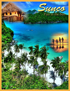
1. This project was also done in Adobe Photoshop.
2. I found all three images online and opened them up in Photoshop.
3. I adjusted the canvas size of the back picture to make it 8.5" x 11".
4. I then dragged the 2 images onto the background and began to quick mask them with the gradient tool.
5. Then I added text and made the two fonts completely different.
6. To finish it off I added a stroke to the image.
The purpose of this assignment was to create an ad for a travel agency and make people want to join the agency. The final product was an ad with 2 images quick masked onto the third image. I love how images can just blend into each other with the gradient and quick mask tool.
No comments:
Post a Comment